Finals, Graduation and Beyond

As finals roll on to the TCU campus, students who have been lucky enough to graduate early are looking for the next step, the next piece of the puzzle, and where their next paycheck will be coming from (and for some – it may be the first paycheck).

Although I may just be avoiding studying, but just watching these brave souls venture out into the wilderness known as reality, I’ve begun to think about my future. Even though I still have roughly 18 months to go before I graduate with my degree in Strategic Communication from TCU, it’s never too early to think about the future.

A few months ago, I met with a creative at Launch, an advertising firm in Dallas, to talk about advertising and essentially what it takes to succeed. His big advice was portfolio school. Portfolio school is similar to a finishing school for creatives interested in Art Direction, Copywriting, etc. It’s also similar to a Master’s degree, but instead of a diploma in your hand, you end the program with an outstanding book that will help you to get a foot in the door.

This all sounds fine and dandy – but the problem is two things: money and time. Most portfolio schools are two-year programs that cost around $30,000 for the entire education. I will be going to school for more time expected, with more loans I never expected to have entering the work force. These are some of my major concerns. My minor concerns include work load (could I even handle it?), moving away to a big city on my own (think Chicago, Miami, or Atlanta?), and applying for these selective programs (we are talking anywhere between 20 to 200 are accepted, out of hundreds of applicants). All of these factors are freaking me out beyond recognition.

Applying to college wasn’t this stressful from what I remember.

But portfolio school has some BIG benefits. Having a portfolio school listed on a resume is an instant HELLO! to potential employers. It signifies you have a specific education that will pertain to a job. You will work in professional settings on assignments that prepare you to think through the business of the creative process. You learn how to create an idea visually (if you do Art Direction, if I did Copywriting it would verbally) and you go beyond a typical design atheistic.

As an Art Director (which is something I am highly considering at this point as a job path) you learn how to solve a client’s problem with a 360 degree solution. You learn the flow of communication and teach you how to concept for good ideas. The key to being a successful art director is storytelling, visual metaphors, and great ideas. In portfolio school you try to prove that you have real world experience – without really having it. You tie the big idea of a campaign together through POP, web design, and basic print. You think about a consumer and how a campaign will intersect with their life and speak to them in a creative and personal way.

Portfolio school will teach me how to create

the big picture.

The decision on whether to do this is complicated. It’s a big risk that could have an even bigger reward in the end. But right now, every day it seems like a better idea. After going to the Senior Graphic Design Show today, I realize that I won’t be able to graduate and do the same level of work they are doing. In order to have the same skill set as them I will need to go to portfolio school and work on my skills for a year or two and have a great portfolio to show at job interviews. It’s all up in the air right now, I’m going to continue to do more research on the portfolio schools listed below and keep my options open.

Portfolio Schools

It’s no secret that these are some of the best schools for portfolios but these are my top choices for right now.

Miami Ad School

Portfolio Center

Chicago Portfolio School

Creative Circus

Art Center 

The Ads are Changing as Fast as the Leaves

At this point in the semester Texas is starting to venture down into the mid 60s outside and girls are starting to pull on their boots and leggings. College midterms have passed and it seems like a narrow road to finals week. However, football is in full swing and there are plenty of holidays to look forward to this season.

Amidst all of this fall action, advertising is turning up the volume with some splendid spots on television. Fall fashion magazines are filled with print ads that inspire fashion creativity. I’m going to take some time to outline a few of my favorites so far this season.

Televison

This commercial for Canal+ is absolutely hilarious and so well done.

I was lucky enough to hear from Leo Burnett about their strategy behind the Mayhem commercials. The new ‘Blind Spot‘ commercial is my favorite so far.

This spot for EA Games is actually a fantastic spot for video games.

Alcohol is one of the most interesting advertising forums. The commercials can range from witty to hilarious to fun to corny. Luckily this one for Wiserhood is extremely clever.

I just saw this ad for Norwegian Cruises that was really great.

Print

Absolut Vodka: Outrageous

AWARD: Get Your Name On It, Art Director

Citroën Jumper Minibus: Wolf

Bulmers Cider: Walt

Owning Color

Target. A store with cantaloupes, cartoons, and car tires all in one place. A store whose advertising is always spot-on and consistent with its voice and positioning. There’s also one thing that Target is known for: red. Michael Francis, Senior VP of Marketing for Target, stated back in 2003 that he planned on “owning red“. Fast-forward to 2010 and that’s the only color we think of is red (and white).

In addition, many companies have followed this form. McDonald’s golden arches, University of Texas’ burnt orange, and the new Pistachio’s green.

These companies have done a great job in associating not only a product benefit or user benefit with their product or brand, but an entire color. So much so that they can go as far as to send a cease and desist order . My PR professor, Jacque Lambiase, explained to use that the Fort Worth logo was considered too close to the UT logo and they were forced to change it.

Before, the logo was more orange and the horns were more similar.

This whole post was inspired by a Reese’s commercial, which after watching I realized that Reese’s is beginning to own orange. Immediately, just the background of their ad was on the screen and I knew it was Reese’s.

Merry Christmas! 🙂

Alberto Seveso

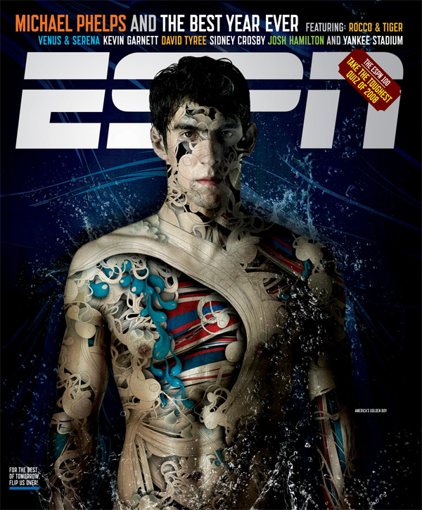
I remember seeing an ESPN cover while babysitting when I was 16 that had the coolest graphic on it. I remember tracing it and trying to use the same affect for an ad I was designing in one of my classes in high school. Of course, duplicating the work behind Alberto Seveso is more complicated that just using a pencil and some tracing paper. As he says, “Yes, sure, try,try,try and try!, it’s the only way to be a master.”

Here is the original cover. It’s amazing the movement portrayed in the photo. The way the vector shapes give rhythm and convey action is astonishing.

Alberto Seveso is a freelance graphic artist who was born in Milan but it now working in Rome. He does his work entirely on Photoshop and Illustrator and does a lot of work for magazines and ads. I think this technique leaves a lot for a creative to use. While yes, the graphic is extremely loud and and calls attention to itself, it also manages to lend itself to type and layout creativity.

I personally love his designs for the playful aspect. The colors are usually vibrant and add to the energy of the pictures.

He calls his technique “sperm shaping” and often laughs at the name.

Sources (interviews from both sites)

abduzeedo

veerle’s blog