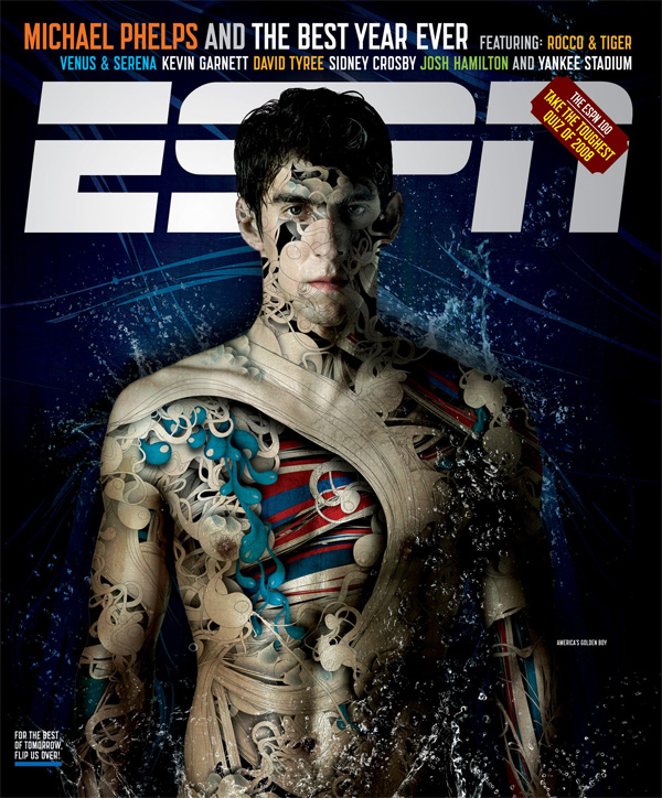
I remember seeing an ESPN cover while babysitting when I was 16 that had the coolest graphic on it. I remember tracing it and trying to use the same affect for an ad I was designing in one of my classes in high school. Of course, duplicating the work behind Alberto Seveso is more complicated that just using a pencil and some tracing paper. As he says, “Yes, sure, try,try,try and try!, it’s the only way to be a master.”
Here is the original cover. It’s amazing the movement portrayed in the photo. The way the vector shapes give rhythm and convey action is astonishing.
Alberto Seveso is a freelance graphic artist who was born in Milan but it now working in Rome. He does his work entirely on Photoshop and Illustrator and does a lot of work for magazines and ads. I think this technique leaves a lot for a creative to use. While yes, the graphic is extremely loud and and calls attention to itself, it also manages to lend itself to type and layout creativity.
I personally love his designs for the playful aspect. The colors are usually vibrant and add to the energy of the pictures.
He calls his technique “sperm shaping” and often laughs at the name.
Sources (interviews from both sites)


Very beautiful work, reminds me of a similar graphic artist Agustealo. This image is mind blowing prob one of my fave http://agustealo.com/component/k2/item/24-garden-flower
Similar techniques but different in style.
Should get some of his work on here too.